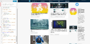
ブログの記事一覧が現在こんな感じなんですが
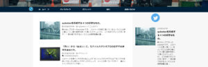
↓
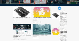
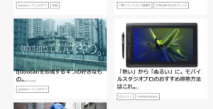
こんな感じで記事をカードで表示したいんですよね。
やっぱカード化するとインパクトあるし、お洒落な感じするし、同じページ内で入ってくる情報量が増えるし。
ということで前回に引き続きCSSをいじってみることに。
*取り組む前に、バックアップを忘れずにね!!
ステップ1・サムネの大きさをそろえる
これをしないと最終的にカードの大きさがばらばらになっちゃったので。(一回経験済)
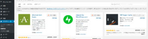
Regenerate Thumbnailsを入手
ダッシュボード→プラグイン→新規追加で
Regenerate Thumbnailsというプラグインを検索&インストール、有効化。
大きさをそろえる
ダッシュボード→ツール→regenerate Thumnailsへ。
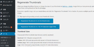
二つ青いボタンがありますね。
英語読めないんですがとりあえず下の方のボタンをポチったらサムネイルの大きさがそろいました。
ステップ2・カード化
*試行錯誤の過程も書いているので結果だけ知りたい人は、下の方の「ステップ2まとめ」のあとだけ読んでもらえればオッケーです。
[open title=’バカが試行錯誤してる様子をみてやるぞ!という物好きはこちら’]今回もこちらを参考に色々いじってみることに。
[blogcard url=”https://www.d-3.site/entry/2017/11/13/060000″]コピペでいけるのですぐできる!
「やったか?!」
やtt・・・あれ??
よく見るとちょっと字が画像とかぶっている・・・
エラーも出ている・・・。(のちに解決)
この追加CSS以外は上手いこといっているので別の方法を考えてみる。
そうこうしているうちにここにたどり着いたのがここ。
[blogcard url=”https://web-ashibi.net/archives/771″]stinger7の記事だけど、いけるかなぁ。だめだったら消したらいいし、just do it!!
お!上手いこと表示された!!完成!!
しかしもうちょっとディティールを自分好みにしたい!
上の記事のコピペでできた画像にカーソルを置くと少し拡大されるという機能はほしい!!
とかいう感じで二つの記事の追加CSSを色々魔改造してみた。
[/open]ステップ2まとめ
僕はこちらの記事を参考に一番最後の「CSSで見栄えを整える」以外を実践し
[blogcard url=”https://www.d-3.site/entry/2017/11/13/060000″]以下を追加CSSに書き込みました。
.itiran-custom dl {
width: 48%;
float: left;
padding: 0;
margin-right: 4%;
margin-bottom: 20px;
}
.itiran-custom dl:nth-child(2n) {
margin-right: 0;
}
.itiran-custom dl:last-child {
padding: 0;
margin-bottom: 20px;
}
.itiran-custom dt {
float: none;
width: 100%;
}
.itiran-custom dt img {
width: 100%;
height: auto;
}
.itiran-custom dd {
height: 120px; /* タイトル・日付・カテゴリ部分のボックスの高さ */
padding: 0px;
}
@media only screen and (max-width: 413px) {
.itiran-custom dl {
width: 100%;
float: none;
margin-right: 0;
margin-bottom: 20px;
}
.itiran-custom dd {
height: auto;
padding: 10px;
}
}
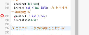
/* カテゴリー・タグの装飾 */
.itiran-cat {
margin-top: 0px;
font-size: 10px; /* カテゴリーの文字サイズ */
}
.itiran-cat a {
background: #fff; /* カテゴリー枠内の色 */
margin-right: 6px;
margin-bottom: 6px;
color: #333; /* カテゴリー枠内の文字色 */
padding: 2px 8px;
border: solid 1px #4333;
/* カテゴリー枠線の色 */
display: inline-block;
transition:0.5s;
}
/* カテゴリー・タグの装飾ここまで */
/*記事タイトルマウスオーバー時の効果
——————————–*/
.itiran-custom dl h3 a:hover {
color: #F474D1; /* ここを変更するとタイトルにマウスオーバーした際の文字色を変更できる */
-webkit-animation: zoom .3s;
animation: zoom .3s;
}
@-webkit-keyframes zoom {
50% {
-webkit-transform: scale(1.05);
}
}
@keyframes zoom {
50% {
transform: scale(1.05);
}
}
/*ここまで*/
/*投稿日・カテゴリー・タグの表示調整
——————————–*/
/* 投稿日の装飾 */
.itiran-time {
color: #888; /* 投稿日の文字色 */
font-size: 3px; /* 投稿日の文字サイズ */
margin-top: -0px;
margin-bottom: 6px;
}
/* 投稿日の装飾ここまで */
/*記事一覧の余白・背景を削除する
——————————–*/
.backnon {
background: none;
padding: 0 10px;
}
@media only screen and (min-width: 781px) {
.backnon {
padding: 0;
}
}
/*ここまで*/
/* カテゴリー・タグのスマホ装飾 */
@media only screen and (max-width: 413px) {
.itiran-cat {
margin-top: -5px;
font-size: 10px; /* カテゴリーの文字サイズ */
}
}
/* カテゴリー・タグのスマホ装飾ここまで */
/* カテゴリー・タグのマウスオーバー装飾 */
.itiran-cat a:hover {
background: #1db2f5; /*ここを変更するとマウスオーバー時の枠内色を変更できる*/
}
/* カテゴリー・タグのマウスオーバー装飾ここまで */
/* 記事アイキャッチマウスオーバー時拡大
——————————–*/
.itiran-custom dt {
overflow: hidden;
}
.itiran-custom dt img{
transition: 0.3s;
}
.itiran-custom dt img:hover {
-webkit-transform: scale(1.1);
-moz-transform: scale(1.1);
-ms-transform: scale(1.1);
-o-transform: scale(1.1);
transform: scale(1.1);
}
/* ここまで */
これにて完了!!!
ちょっとは見栄えがよくなったかな・・・?
[box class=”box28″ title=”合わせて読みたい”]stinger plus2でヘッダー周りを画面端まで簡単に引き延ばしてみた
[/box]